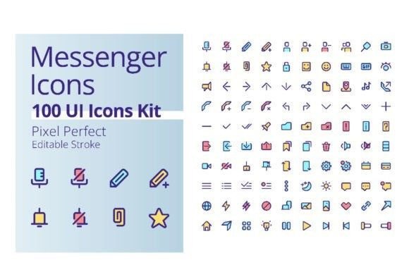
Messenger Application UI Icons Kit
When you’re building a mobile app, a website, or any digital product that revolves around communication, the little visual details often make the biggest difference. Icons guide users, convey actions, and set the tone for the entire experience. The Messenger Application UI Icons Kit is one of those resources that can save you hours of design time while giving your project a polished, professional look. Whether you are a seasoned designer, a business owner launching a social platform, or a creator developing a messaging feature, this collection is worth understanding in depth.
Understanding the Messenger Application UI Icons Kit
At its core, this kit is a set of 100 UI icons specifically crafted for messenger-style applications. These are not generic icons; they are designed to support online interaction, social media, and real-time communication interfaces. Each icon is built in a pixel-perfect RGB color palette, ensuring vibrant and consistent rendering across modern screens. The kit also uses an editable stroke approach, which means you can adjust line thickness and style without losing quality. All icons are aligned with the Poppins font family, so if your interface uses that typeface, everything will feel cohesive right out of the box.
The purpose of this kit is to streamline the design process. Instead of creating every symbol from scratch—chat bubbles, notification bells, send buttons, profile placeholders, and more—you get a ready-to-use library. This lets you focus on the bigger picture: user flow, interaction design, and overall usability. For anyone working on a messaging app, a customer support widget, or even a social networking feature, it is a practical foundation.
A Complete Collection of 100 Icons
Having a dedicated set of icons for a messenger interface is more useful than you might initially think. The kit covers a wide range of actions and states:
- Communication basics: chat, message, email, phone, video call.
- Social interaction: like, share, comment, reaction emojis, user status.
- Navigation and settings: home, search, profile, notifications, gear icon.
- Media and attachments: camera, gallery, microphone, file, location.
- Status and feedback: online, offline, typing, read receipt, muted.
Each icon is rendered in a pixel-perfect grid, meaning it stays crisp at standard display resolutions. The colors are rooted in the RGB spectrum, which is ideal for digital screens. The editable stroke feature gives you control over the visual weight, so you can match the icons to your brand’s design language without starting from scratch.
File Formats and Compatibility
One of the strongest aspects of this kit is its wide file format support. You receive the same set of icons in multiple formats, which makes it easy to integrate into different design workflows.
- EPS – vector format perfect for Adobe Illustrator and other professional vector editors.
- JPEG – raster format on a white background, good for quick previews or non-transparent use.
- AI – native Adobe Illustrator file, fully editable with layers and strokes intact.
- SVG – scalable vector graphic on a transparent background, ideal for web and app development.
- PNG – raster format with transparency, ready for direct use in presentations, mockups, or web assets.
This variety means you can use the icons in design tools like Figma, Sketch, or Adobe XD (via SVG or AI), as well as in code (via SVG) or in marketing materials (via PNG or JPEG). No matter your preferred environment, the kit adapts.
Design Quality and Scalability
Because the icons are vector-based, they scale from small button sizes to large hero sections without any loss of detail. The consistent use of Poppins font for any accompanying text (like badges or labels) ensures a harmonious overall appearance. The editable stroke is not just a gimmick; it allows you to change the stroke weight to match thin, regular, or bold styles across your interface. This level of polish is what separates a generic icon set from one that feels purpose-built for a messenger context.
UI/UX Design for Mobile Apps
Imagine you are designing a new messaging app for a niche community—say, for hobbyists or professional networks. You need icons for group chats, direct messages, push notifications, privacy settings, and media sharing. Instead of hunting through dozens of different sets to find a consistent style, you can pull from this kit. The Messenger Application UI Icons Kit gives you everything in one place. You can prototype the interface quickly, test it with users, and iterate based on feedback without worrying about mismatched icon styles.
Social Media and Online Interaction
Social media platforms rely heavily on icons to convey actions and emotions. Think about the reaction bar on a post, the direct message button, or the story upload icon. This kit covers those exact cases. For example, you might use the send icon for a direct message feature, the heart or thumbs up for reactions, and the camera icon for story uploads. The consistent visual language helps users navigate intuitively, which is crucial for retention and engagement.
Marketing and Brand Materials
Beyond the product itself, you might need icons for promotional materials, help center articles, or onboarding screens. The kit’s JPEG and PNG versions are perfect for quickly dropping into a brochure or infographic. The EPS and AI files let you recolor or resize them to fit a specific marketing template. If you produce vector brochures, infographics, or customizable elements regularly, having a dedicated icon set like this saves time and ensures brand consistency across all touchpoints.
Who Benefits from This Icons Kit?
This resource is not limited to one type of user. Different professionals can leverage it in their own ways:
- UI/UX designers – use the vector files (AI, EPS, SVG) to build realistic prototypes and design systems.
- Mobile app developers – embed SVG or PNG icons directly into the codebase, reducing asset creation time.
- Product managers and business owners – evaluate the icon set to ensure the final product looks cohesive and user-friendly.
- Content creators and marketers – employ the JPEG or PNG versions in social media graphics, blog posts, and video thumbnails.
- Graphic designers and illustrators – use the editable strokes as a starting point for custom icon variations.
The kit is designed for anyone who values speed and quality in their design process. It removes the friction of creating icons from scratch and reduces the risk of visual inconsistencies.
Strengths
- Pixel-perfect RGB colors ensure vibrant and accurate display on screens.
- Multiple file formats (EPS, JPEG, AI, SVG, PNG) cover almost every use case.
- Editable stroke gives you creative control over the icon’s look and feel.
- 100 icons cover the essential messenger-related actions and states.
- Weekly updates from the creators mean the library can grow over time—new graphics every week keep the set relevant.
Considerations and Limitations
- Vector editing software required: to take full advantage of the editable strokes and AI/EPS files, you need a program like Adobe Illustrator or a compatible vector tool.
- Brand-specific customization: while the kit uses a neutral RGB palette, you may need to recolor icons to match a specific brand guide. The editable stroke helps, but it is not an automatic process.
- Not a full design system: this is an icon kit, not a complete UI kit with buttons, cards, or navigation bars. It works best as a component within a larger design system.
- File management: with 100 icons in five formats each, you end up with a large number of files. Good organization is necessary to keep your workflow efficient.
Understanding these points helps you set realistic expectations. The kit is a powerful tool, but it is part of a larger design ecosystem.
How to Choose the Right Icons Kit for Your Project
Not all icon sets are created equal. When evaluating whether the Messenger Application UI Icons Kit fits your needs, consider these factors:
- File format requirements: if your team uses Figma or Sketch, SVG is ideal. If you are producing print materials, AI and EPS give you maximum flexibility. Make sure the formats align with your workflow.
- Color and style consistency: the kit uses a specific RGB palette and Poppins font. If your brand already has strong visual guidelines, test a few icons to see how easily they adapt.
- Customization needs: if you need to heavily modify icons (e.g., change shapes, add details, or adjust proportions), the editable stroke and vector files give you that freedom. If you only need static assets, PNG or JPEG work fine.
- Update frequency: the promise of new graphics every week is a bonus. If your project is ongoing, this can keep your assets fresh without extra effort.
- Scope of the collection: 100 icons is a substantial number for messenger-specific use. However, if your app requires many niche symbols (like complex file type icons or specialized status indicators), you might need to supplement with additional sets.
Taking a few minutes to map your project’s icon needs against these criteria will save you from choosing a set that looks good but doesn’t fit practically.
Final Thoughts
The Messenger Application UI Icons Kit is a well-rounded, practical resource for anyone building or designing digital communication interfaces. Its strength lies in its specificity—it is not trying to be everything; it focuses on what a messaging app needs. The combination of pixel-perfect RGB colors, editable strokes, multiple file formats, and weekly updates makes it a reliable asset for both short-term projects and long-term design systems.
Whether you are launching a social platform, redesigning a customer chat widget, or creating marketing materials for a communication tool, this kit gives you a head start. The icons are ready to use, easy to customize, and built with modern screen standards in mind. If you have ever spent hours searching for the perfect send button or notification bell, you will appreciate having this collection at your fingertips. And with new graphics added regularly, it is a resource that grows alongside your needs.
Before you commit, try a few icons in your actual design environment. Test how they look at different sizes, on different backgrounds, and alongside your existing visuals. If they fit, you have found a solid foundation. If they need small adjustments, the vector formats make that possible. Ultimately, the best icon kit is the one that saves you time and makes your product feel cohesive—and this one delivers on both fronts.